Page 1 of 2
Small suggestion: improve the taskbar icon
Posted: Tue Feb 20, 2018 6:30 pm
by Riojazz
In comparison with other taskbar icons, the Mixcraft icon is rather small and hard to see. The dark green circle makes this worse against the black background on my Windows 10 screen, with the only thing visible being the tiny white flattened '8'. I suggest perhaps a white circle around the icon, or at least a lighter shade of green. Thanks for listening.
Re: Small suggestion: improve the taskbar icon
Posted: Tue Feb 20, 2018 7:26 pm
by Mark Bliss
If you upgrade to pro-Studio its a red hexagon..... No extra charge!

Re: Small suggestion: improve the taskbar icon
Posted: Wed Feb 21, 2018 1:52 pm
by Riojazz
?? I have Mixcraft 8 Pro Studio. What red hexagon? It's a tiny dark green circle with a white flattened 8 inside, against (on my screen, anyway) a black taskbar.
Re: Small suggestion: improve the taskbar icon
Posted: Wed Feb 21, 2018 1:57 pm
by Riojazz
Oh, wait a minute. I experimented with Windows colors and now I see a hexagon. But it's green when the program is closed, and red only when it's open.
It's still very hard to see when closed, no matter what color settings I use in Windows.
Re: Small suggestion: improve the taskbar icon
Posted: Wed Feb 21, 2018 2:56 pm
by Mark Bliss
You close the program????

I know some screen resolution settings make the taskbar icons appear very small.....
But theres other options for opening the program-
In Win 10 I have four options, not including starting from a project folder.
*(The last one shown is a desktop shortcut.)
https://drive.google.com/open?id=1vj2Pg ... xhWTXqsOI2
Re: Small suggestion: improve the taskbar icon
Posted: Wed Feb 21, 2018 5:28 pm
by comedians
Could it be that the 32bit is Green & the 64bit is Red, only guessing as I don't have both installed, however you can change the Icon by right clicking the shortcut, choose Properties then change Icon. There should be a choice of 4 or 5 I believe.
Re: Small suggestion: improve the taskbar icon
Posted: Wed Feb 21, 2018 7:14 pm
by Mark Bliss
Yeah, that may be correct. I was just making a joke about the red/green though.
I am betting its a tiny icon due to screen resolution settings.
Re: Small suggestion: improve the taskbar icon
Posted: Thu Feb 22, 2018 11:03 am
by Riojazz
Thanks, I'll play along with some settings again. But if the other icons on my Taskbar are all easier to read, regardless of resolution, I think the one for Mixcraft deserves a look.
And yes, I've been known to close Mixcraft. That's the problem, I guess, finding it to start again!
Re: Small suggestion: improve the taskbar icon
Posted: Thu Feb 22, 2018 11:07 am
by Riojazz
I tried changing the icon via properties, from green to red, but this only affects the larger icon on the desktop, not the tiny one in the taskbar.
EDIT: nevermind, I deleted the old taskbar shortcut and dragged the new red icon to the taskbar. It's red. It's still too small and hard to see, but it's better than it was.
Re: Small suggestion: improve the taskbar icon
Posted: Thu Feb 22, 2018 11:25 am
by Acoustica Greg
Hi,
Right-click on your taskbar, select Taskbar Settings, and make sure that you don't have "Use small taskbar buttons" selected.
You could experiment with the "Combine taskbar buttons" settings and choose "When taskbar is full" to see descriptions next to the icons. Probably not what you want.
Greg
Re: Small suggestion: improve the taskbar icon
Posted: Thu Feb 22, 2018 11:29 am
by Riojazz
Thank you, yes, I do have small icons set for the taskbar, but I like it that way. Again, if the Mixcraft button is not as visible as the other icons, I think that warrants mentioning. Now, with the 'normal' size icons, my (larger) icons spill onto two rows, losing even more screen space. But thanks for the idea.
Re: Small suggestion: improve the taskbar icon
Posted: Thu Feb 22, 2018 11:36 am
by Acoustica Greg
Hi,
And the other option would be to not have a black background, of course.
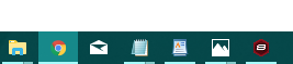
- Small taskbar
- small_taskbar_icons.png (6.18 KiB) Viewed 6807 times
Greg
Re: Small suggestion: improve the taskbar icon
Posted: Thu Feb 22, 2018 2:26 pm
by Riojazz
I haven't found that option yet; still looking.
And thank you for listening. I still think that, in your small icon graphic, the Mixcraft icon is harder to see than the others.
Re: Small suggestion: improve the taskbar icon
Posted: Thu Feb 22, 2018 2:31 pm
by Acoustica Greg
Hi,
Right-click on desktop > Personalize > Colors.
Sometimes it's fun to set it to "Automatically pick an accent color from my background," but the result of that would depend upon what your background image is.
Thanks for the feedback!
Greg
Re: Small suggestion: improve the taskbar icon
Posted: Thu Feb 22, 2018 2:49 pm
by mick
You could also give "auto hide the taskbar" a try and set the taskbar to show bigger icons when the taskbar pops up with the mouse pointer.
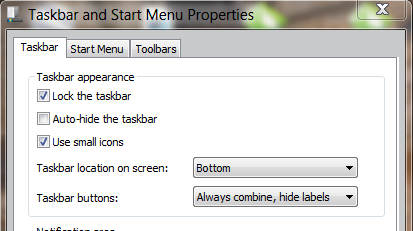
- task.PNG (47.48 KiB) Viewed 6783 times