Page 1 of 5
Modernize the user interface
Posted: Sat Jan 12, 2019 11:15 am
by sixstorm1
Everytime I launch Mixcraft I feel like I am going back to 2003. The UX hasn't been updated since Windows XP and it needs to be modernized. Photorealistic icons, PNGs and gradient buttons everywhere feels terribly old. Also it makes Mixcraft to not scale well (at all) on high-DPI monitors, it's all blurry. Please make a modern and clean UX for Mixcraft 9. Traktor Pro 3 is an example of an audio product with modern and clean UX.
Re: Modernize the user interface
Posted: Sat Jan 12, 2019 11:51 am
by freightgod
The Revolution has begun!
Re: Modernize the user interface
Posted: Sat Jan 12, 2019 6:18 pm
by FrankClau
I join the request
Re: Modernize the user interface
Posted: Sat Jan 12, 2019 7:46 pm
by bigaquarium
Evening!
Through some industrial espionage I have discovered that your wish has been granted; Acoustica will be releasing a retro-modern interface starting with Mixcraft 9.

Best,
-N
Re: Modernize the user interface
Posted: Sat Jan 12, 2019 8:24 pm
by sixstorm1
@bigaquarium,
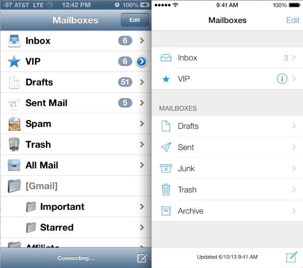
I see a bit of improvements here and there. Is it still a work in progress? It is still not very modern. Still an awful lot of gradients everywhere and old-looking, Windows-XP-style icons. In modern UX design, rendering is entirely programmatic (no raster gradients or PNG images), and icons are SVGs so they can scale on high-DPI monitors.
Here is an example of old vs modern UI (here iOS 6 vs iOS 7):

Mixcraft looks (and still looks) like the UX on the left...
Thank you
Re: Modernize the user interface
Posted: Sat Jan 12, 2019 8:43 pm
by bigaquarium
Evening,
LOL Sorry, I was having a bit of fun. That's what Mixcraft 5 looks like!
Best,
-N
Re: Modernize the user interface
Posted: Sat Jan 12, 2019 9:54 pm
by Thomas
I tend to favor more analogue looking interfaces and I prefer the UI on the left. If I awoke from a 15 year time capsule, I would presume the iOS 7 UI was older and the iOS 6 UI more advanced. I also noticed that Windows and Android seems like they've gone backwards in their aesthetic. Now, there may be technical reasons why they did this, perhaps some brought up in this thread.
Re: Modernize the user interface
Posted: Sun Jan 13, 2019 4:30 am
by Ian Craig
bigaquarium wrote:Evening!
Through some industrial espionage I have discovered that your wish has been granted; Acoustica will be releasing a retro-modern interface starting with Mixcraft 9:
NewInterface.PNG (203.22 KiB)

Best,
Nathan

class
@sixstorm1
Personally, I need something I can actually see and as far as that is concerned Microsoft have progressively made it almost impossible for me to see anything in Windows since Windows 95 (when it was possible to have all windows with a light blue background and all title bars and text exactly as needed). Today's Windows 10 is useless to me, it's all grey on grey with no configuration options, which is why I stay with Windows 8. So if modern programming is anything to go by I'd prefer anything sane, not modern. Plugins work best when they use vector scaling of all elements and total user configuration options, just like operating systems.
Re: Modernize the user interface
Posted: Sun Jan 13, 2019 7:35 am
by mick
Generally, the Mixcraft Gui is fine for me (but only because I tweaked the thing away from the original) but the fonts are too fat and glare' y. Something like "Arial" is sharper / more defined but in black on a lighter background.
On the piano roll, the note icons are grey on grey when in the OFF state and grey on grey in the ON state, 2 shades of grey but not much difference between so I have to ponder "is this the on or off grey?" Ableton has a great look of nice and happy with icons lighting up like a las vegas casino (and this for me gives the impression the software is communicating instead of a "I'll think about it" look) whilst what looks like the Ableton clone called Bitwig is the most horrible thing out there, and some of the themes for Reaper designed by users are crazy, so the use of colours is undoubtedly tricky to please everybody. I'll settle for Mixcraft as is if the icons became more defined when clicked on and the fonts were updated from Mixcraft 1.
Re: Modernize the user interface
Posted: Sun Jan 13, 2019 8:43 am
by Mark Bliss

if I were forced to stare at Bitwig for an hour I think I would become suicidal! And the "modern graphics", (Win10 included) are hideously bad!
While there are several minor areas where the graphics in Mixcraft could benefit from some tweaking, as as been discussed here so many times...
My opinion remains that there are at least a dozen (for my personal needs and interests) feature additions or functional tweaks that are more important by a huge margin than any graphical changes.
Right now, a change in graphics alone wouldn't move my interest meter much.
I guess I just like the "classic" look myself. Opinions vary.

Re: Modernize the user interface
Posted: Sun Jan 13, 2019 9:01 am
by jlouvar
So if I’m understanding this thread correctly this is all a visual thing, as in you’re suggesting that Mixcraft 9 should include a moveable transport (which it will), and the option for users to use their own icons and colors? If so, maybe this should be in Mixcraft Suggestions thread?
Re: Modernize the user interface
Posted: Sun Jan 13, 2019 10:21 am
by Mark Bliss
jlouvar wrote:as in you’re suggesting that Mixcraft 9 should include a moveable transport (which it will)
No one has said "it will" and arent likely to in my experience as new version features are generally not disclosed pre-release.
All that was confirmed is that is has been suggested and logged as a feature request.
jlouvar wrote:If so, maybe this should be in Mixcraft Suggestions thread?
It has been, multiple times actually I think.

Re: Modernize the user interface
Posted: Sun Jan 13, 2019 11:07 am
by mick
Just an opinion about the icons, its no big deal.

Re: Modernize the user interface
Posted: Sun Jan 13, 2019 12:00 pm
by jlouvar
Mark Bliss wrote:jlouvar wrote:as in you’re suggesting that Mixcraft 9 should include a moveable transport (which it will)
No one has said "it will" and arent likely to in my experience as new version features are generally not disclosed pre-release.
All that was confirmed is that is has been suggested and logged as a feature request.
jlouvar wrote:If so, maybe this should be in Mixcraft Suggestions thread?
It has been, multiple times actually I think.

Oh okay. I only based my comment on what Greg said in another thread (and if it’s already been suggested many times before, all the more reason to think it will). So I’m guessing it will.

Acoustica Greg wrote:Hi,
An undockable transport control is definitely one of the suggestions for Mixcraft 9.
Greg
Re: Modernize the user interface
Posted: Sun Jan 13, 2019 5:32 pm
by comedians
Firstly I think this should have been posted in the Mixcraft Suggestions area, perhaps there is a thread already
Personally I'm more interested in what it does than how it looks, besides I quite like the retro look - which seems to be coming back into fashion with many things nowadays. Yes a new font & a few graphic changes might add a bit of glitz !
Today's Windows 10 is useless to me, it's all grey on grey with no configuration options,
Must disagree Ian - I think Win10 is the best version ever for customisation and although I never use themes there are hundreds of them in all styles & colours. You can turn it into anything. Change colours, change icons, change themes — within only a few minutes, you can create a desktop. It even has it's on Personalise section.
